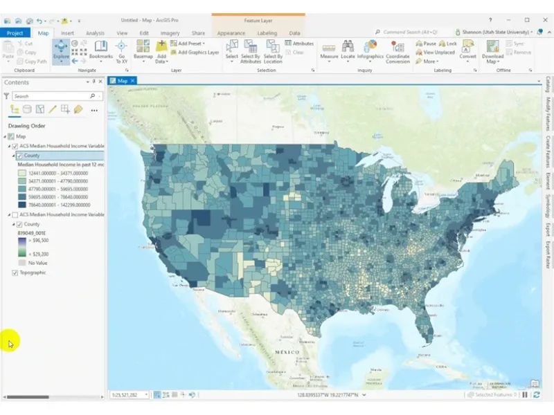
A choropleth map shades areas such as LSOAs, MSOAs, wards or postcode sectors by a value like demand, uptake, deprivation, sales density or outage rate so patterns are clear at a glance. They are popular in business and the public sector because they compress complex information into a format decision-makers can read quickly.
That speed is also the risk. A choropleth can look obvious while quietly embedding assumptions about geography, population and classification. Used well, it helps teams agree where to focus and why. Used poorly, it can harden a misleading story, for example that an area has no demand, which later proves costly.

Choropleths in market and demand decisions
Choropleths are most useful when you need to compare places consistently. They bring structure to discussions that might otherwise rely on anecdotes, local knowledge or spreadsheets that ignore geography. In practical projects, they appear early for exploration and later as part of packs that support investment cases, service reviews or targeted engagement.
Be clear what the map is and is not showing. Choropleths do not show individual customers. They summarise a metric over a boundary, so the boundary choice and metric definition matter as much as the colours.
Decisions choropleths support
In market and demand work, choropleths support prioritisation, for example where to focus sales effort, where to expand capacity or where to validate assumptions with further research. A utilities team might map incident rates per 1,000 properties to identify clusters worth investigating. A retail team might map penetration rates to understand under-served territories.
They are also useful for communicating change over time. Mapping growth year on year or pre and post intervention change, normalised appropriately, helps show where initiatives are working. When paired with other spatial analysis such as catchments, accessibility or network constraints, choropleths become a practical decision layer rather than a standalone picture. See related context on what spatial analysis involves in real projects.
Fit-for-purpose versus misleading outputs
A choropleth is fit for purpose when the geography matches how the phenomenon behaves. If demand relates to households, a household-based denominator and a residential geography make sense. If demand relates to footfall, a residential boundary can be misleading even if the map looks tidy.
Misleading outputs often come from three issues: using raw counts instead of rates, using boundaries that hide variation, or choosing a classification that exaggerates differences. A high demand area might simply be large, densely populated or home to a major site that dominates the statistics. Treat the choropleth as a starting point, then test whether the pattern holds under alternative denominators, boundary scales or time windows.
Map design choices that affect interpretation
Design choices are not cosmetic, they change the story the map tells. In delivery, we often spend as much time agreeing the geography and metric as we do building the map, because that is where most misinterpretation starts.
A strong design is consistent, repeatable and open about uncertainty. It should help users compare areas fairly, not reward the biggest polygons or the most volatile small-number areas.
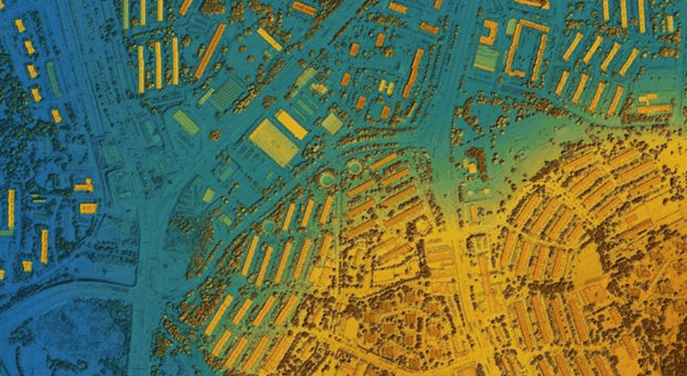
Geographic units and spatial resolution
Your boundary choice controls both detail and stability. Fine-grain geographies such as LSOAs show local variation but can become noisy, especially when the data is sparse. Coarser geographies such as MSOAs or local authorities produce more stable values but can smooth away pockets of demand that matter operationally.
Resolution also needs to align to decisions. If budgets are allocated by local authority, mapping at LSOA may be interesting but hard to act on. Conversely, if field operations are organised by patch, a high-level map may be too blunt. In practice, prototype at two scales and check whether the same areas remain priorities under both views.
Normalised measures and denominators
A choropleth should usually map a rate, ratio or index that accounts for exposure. Raw counts are appropriate only when you care about volume rather than intensity, for example total service calls to staff a contact centre. For demand analysis, intensity often matters more, such as uptake per household, faults per kilometre of network, claims per policy or referrals per 10,000 residents.
Picking the denominator is where projects succeed or fail. Per population is not automatically correct. For broadband take-up, normalise by premises. For EV charger demand, use households without off-street parking rather than total residents. A poor denominator can systematically favour city centres or penalise rural areas, and teams will draw the wrong operational conclusions.
Classification and colour specification
Classification determines which differences are visible. Equal intervals can hide variation if the data is skewed. Quantiles can overstate differences by forcing an even spread. Natural breaks can be persuasive but hard to compare between maps. If you need comparisons across time or regions, fixed class breaks are often the most defensible even if the map looks less balanced.
Colour matters too. Use a sequential palette for low to high values, and a diverging palette when there is a meaningful midpoint such as national average. Avoid saturated ramps that make moderate differences look dramatic. Plan for accessibility. Colour-blind friendly palettes and clear legends are not optional when maps appear in governance packs.
Data and delivery workflow
A choropleth that influences decisions needs an auditable workflow. Most of the work is not the map itself, it is boundary management, joins, QA and agreeing how uncertainty is handled. The moment a choropleth becomes part of a KPI pack or a board paper, you need to be able to explain exactly how each shaded area was calculated.
From a consultancy perspective, we make choropleths repeatable so the same steps can run next month with fresh data, producing comparable outputs without reinventing the method.
UK data inputs and boundary management
In the UK, common boundary sources include Office for National Statistics open geographies, LSOA, MSOA and local authority, Ordnance Survey boundary products, and client-defined operational areas such as sales territories, depot patches or network zones. The tricky part is ensuring boundaries match the time period of your data. LSOA codes and local authority structures can change, which affects trend analysis.
Boundary management also covers projection, simplification for web performance and consistent IDs for joining. If you are combining sources such as customer counts, deprivation indices and asset coverage, use a stable boundary set with documented versioning so comparisons remain meaningful.
Join, QA, and uncertainty checks
Attribute joins are where silent failures happen, for example missing codes, mismatched formats, duplicate records or data that does not sum the way stakeholders expect. QA should include reconciliation so totals match the source, spatial sense checks to confirm values appear where you would expect, and outlier review so extreme values are explained, not ignored.
Uncertainty checks are often overlooked. If a few areas have very small denominators, rates can swing wildly month to month. Flag low-base areas and provide a simple confidence note or table. Users then understand that an apparent hotspot might be statistical noise rather than a true operational signal.
Deliverables and deployment formats
Deliverables depend on who needs to use the choropleth. Some organisations want a static PDF for reporting. Others need an interactive layer embedded in an internal portal or a BI tool. Agree early whether the choropleth is a one-off insight or a maintained product.
Typical outputs include web maps for exploration, print-ready exports for governance packs and data extracts for analysts. If the choropleth sits alongside other GIS layers such as assets, planned works or catchments, a Web GIS approach is usually more sustainable. For teams building wider spatial analytics capability, it helps to align with existing GIS practice and data models.
See the benefits of geospatial data in analytics.
Business applications across infrastructure and services
Choropleths appear across infrastructure and service delivery because they translate operational metrics into geography, for example where customers are, where incidents concentrate, where services are under-used and where growth is likely. They are especially helpful in cross-functional settings, engineering, commercial and customer teams, because a shared map reduces jargon and speeds up alignment.
The best applications do not stop at red versus blue areas. They connect patterns to drivers such as accessibility, network capacity, socio-demographics, land use or service constraints.
Utilities and telecoms demand planning
Utilities and telecoms teams use choropleths to support both growth and resilience planning. Demand can be mapped as connections per feeder area, take-up rates by postcode sector or fault rates by district. Combined with network constraints, the map highlights where demand exists but capacity limits delivery, or where investment could unlock growth.
A common pattern is mapping eligible premises versus connected premises to highlight conversion opportunity, then layering in build plans and cost surfaces. Work like this often sits within broader GIS capability in the sector.
See GIS for telecommunications and utilities.
Local authority and public service demand mapping
Local authorities use choropleths to understand where needs are greatest and how services align. Examples include mapping referrals per 10,000 residents, service take-up rates or response times normalised by population or households. The maps can support equitable resource allocation if denominators and suppression rules are handled carefully.
Interpretation is the sensitivity. A high value may reflect higher need, better reporting or simply better access to the service. Choropleths are strongest when paired with context such as deprivation, age profiles and rurality, and when used to trigger local validation rather than to rank communities.
Property, retail, and territory management
In property and retail, choropleths often underpin territory reviews and site screening. Mapping revenue per household, penetration by segment or delivery density helps teams see where performance deviates from expectation. When territory boundaries do not match administrative geographies, build bespoke zones such as drive-time catchments or sales patches and create choropleths on those units.
The operational benefit is clarity. Territory managers can see where to focus visits, campaigns or partner engagement. The risk is overconfidence, as performance might be driven by a few major accounts, a shopping centre or commuter flows that residential boundaries do not capture.
Risk controls and decision framing
Choropleths are persuasive, which means they need guardrails. On mature programmes, treat choropleths as decision support, not decision proof. That framing changes the conversation. Instead of asking which areas are worst, ask what the pattern suggests and what else to check before acting.
Risk controls do not have to be heavy. A few disciplined choices on geography, denominators and small-number handling make choropleths far safer for operational and strategic decisions.
MAUP, ecological fallacy, and over-interpretation
The Modifiable Areal Unit Problem, MAUP, is the reality that patterns change when you change the boundaries or scale. An apparent hotspot at ward level may disappear at LSOA level, or the other way round. That does not mean the data is wrong, it means aggregation is influencing what you see.
Ecological fallacy is the second trap, assuming that what is true for an area is true for individuals within it. A high-demand MSOA does not mean every neighbourhood in it is high demand. This matters when teams target interventions at a fine scale, door to door, street works, local outreach, based on a coarse choropleth.
Small numbers, suppression, and smoothing
Small denominators create unstable rates. In demand mapping, this often shows up in rural areas or niche services where one or two events can make a place look extreme. Controls include suppression, not showing values below a threshold, aggregation to a larger geography or smoothing such as multi-year averages.
The right choice depends on governance and the stakes. For public-sector mapping, suppression may be needed for confidentiality. For commercial work, smoothing can help trend stability, but be transparent. Users should know whether they are looking at last month’s value or a 12-month rolling rate.
From patterns to prioritised actions
A choropleth should lead to a shortlist of actions, not a long debate about colours. Turn map patterns into a prioritisation workflow. Agree the metric, agree the geography, define thresholds, then validate with local knowledge and operational constraints such as capacity, access, cost and risk.
If you are using choropleths to justify investment, include a short narrative alongside the map, what is driving the pattern, what is uncertain and what further analysis is planned. Teams get better outcomes when choropleths are embedded in a transparent decision process rather than used as a standalone answer.