Maps have always helped people understand the world. Long before satellites or screens, travellers drew their own routes by hand, marking coastlines and paths as they went. The idea hasn’t changed much, only the tools have. We now look at maps on phones or laptops instead of unfolding paper ones on a table.
Even with all the technology around us, maps still do something no report or table can. They show how places fit together. A quick look can tell you how far or how high something is, no numbers, just shape and colour. It’s an easy way to picture space and meaning at once.
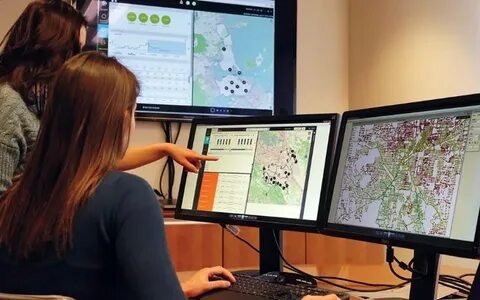
These days, we use things like Google Earth or GIS dashboards, but they’re built on the same simple rules early mapmakers followed, scale, symbols, and layout.
On paper or screen, a map still has its own voice. It speaks through the way colours sit beside each other, how space feels, and how lines pull the eye across a page.
Different map types, physical, political, or thematic, simply train us to look better. They’re not outdated; they still help us piece together how people, land, and data share the same space.
Maps haven’t faded away with technology. They’ve just learned to move. Now they zoom, refresh, and update in moments, guiding not only travellers but anyone trying to understand their surroundings.
Want clearer, smarter map layers for your projects?
Work with our GIS team to build accurate, easy-to-use maps for planning and analysis.
📞 Schedule a Call | 📩 Email Us | 💼 Contact Us
What Makes a Map? The Core Components
When you pick up a map, you don’t really stop to think about what’s there, you just look. Maybe your eyes wander for a second before you realise there’s more going on than it seems. It’s up there like a signboard saying what the map is about. Could be something simple, “Rivers of Asia” or “UK Road Routes.” Without it, you’d be guessing.
Then, somewhere near the corner, there’s a small box. That’s the legend, though most people just call it the key. It’s where the colours and tiny symbols finally make sense. Green might stand for forests, blue for water, little triangles for hills. You glance at the key once and suddenly everything connects, those shapes and colours aren’t random anymore.
Maps are tiny versions of the real world, so they need something to keep proportions right, that’s what the scale does. That little line with numbers? It’s easy to miss but quietly powerful. It tells you that one centimetre here might mean ten kilometres out there. Once you get that, the map starts to feel more real.
There’s also that arrow pointing north. You might ignore it, but try walking somewhere with a paper map and no idea which way is up, you’ll get lost faster than you think. That arrow keeps your sense of direction steady.
And then comes projection. This one’s tricky. The Earth is round, but paper isn’t. So cartographers came up with ways to flatten it. Each method bends something, some stretch distances, some twist shapes. That’s why Greenland sometimes looks massive; it’s just the way the world got flattened.
All these pieces, title, legend, scale, arrow, projection, they work together like parts of a story. The story’s goal depends on who’s reading. A farmer might see where rain falls the most. A traveller just wants roads. Same data, different reasons. That’s what turns a simple drawing into a working map.
When you start seeing these parts, you realise maps aren’t just for experts. They’re quiet teachers, showing you how places connect. Once that clicks, you never look at one the same way again.
10 Main Types of Maps Everyone Should Know
Not all maps are made the same way. Each type serves a different goal, one might show elevation, another political borders, and another how people or resources are spread across the land. Below are the main map types everyone should be familiar with.
1. Physical Maps
You know those big wall maps from school, the colourful ones with the ripples and shading? That’s a physical map. It doesn’t care about borders or city names; it simply shows how the land rises, dips, and flows. Brown areas mean hills or high ground, green shows low land or plains, and blue speaks for water. You don’t need to remember it, your eyes work it out naturally.
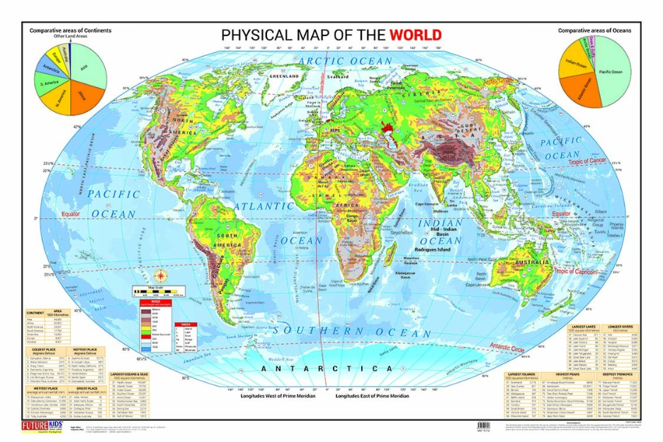
People use these maps for all sorts of reasons. A farmer might check how a field slopes before building drainage. A team studying floods looks at where water would move if rain kept falling. Even hikers glance at one before a trip, just to see where the tough climbs are.
Today, the same idea lives inside GIS. The paper maps have turned into digital ones built from satellite pictures and elevation data. Instead of ink, they use layers of real measurements. The purpose hasn’t shifted: show the ground’s shape so people can plan and act with it in mind.
Look at it for a while and it almost feels like you’re seeing the ground itself. The slopes and flat spots quietly show what wind and rain have done over the years. You start to see why towns grow in some places and not in others.
2. Political Maps
A political map is one you’ve probably seen more than any other. It’s the kind of map that splits the world into countries and marks where towns and borders fall, not by nature but by people’s choices. You’ll often see it hanging in a classroom or behind a reporter when they talk about a boundary change on the news.
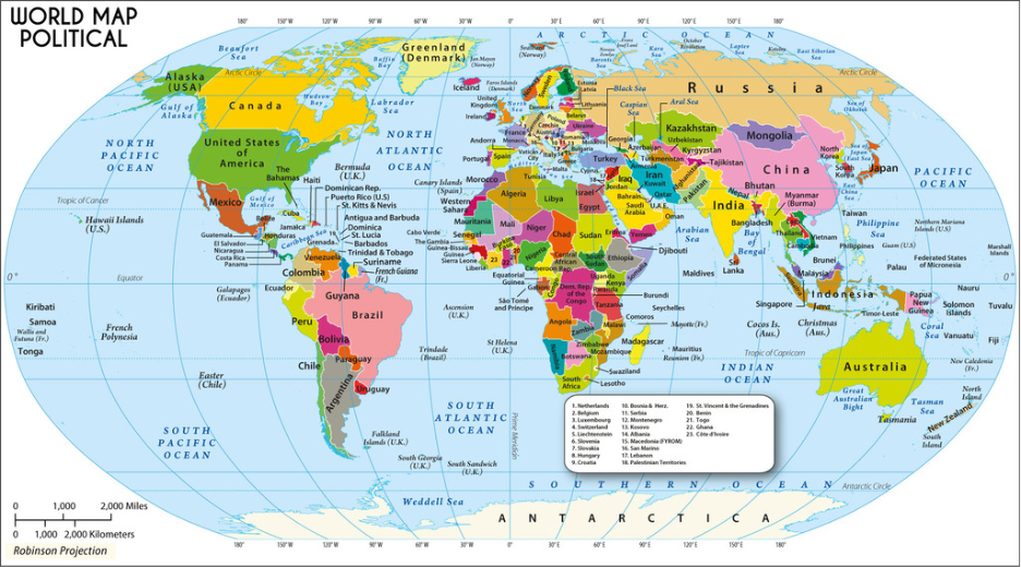
Unlike a physical map, this one doesn’t care about mountains or rivers unless they mark a border. It focuses on who governs which area and how those areas connect. Every line and colour means something, a boundary, a province, a capital.
Teachers, planners, and even everyday readers often check these maps when they want a simple look at regions and borders. When a country splits or a new line is drawn, they’re the first to be updated. Election offices, local authorities, and global groups rely on them to keep their data right.
Inside GIS, political maps become data layers instead of drawings. They can show administrative limits, districts, or postal zones with exact coordinates. Whether printed or digital, the purpose is the same: help people understand how the world is divided, managed, and shared.
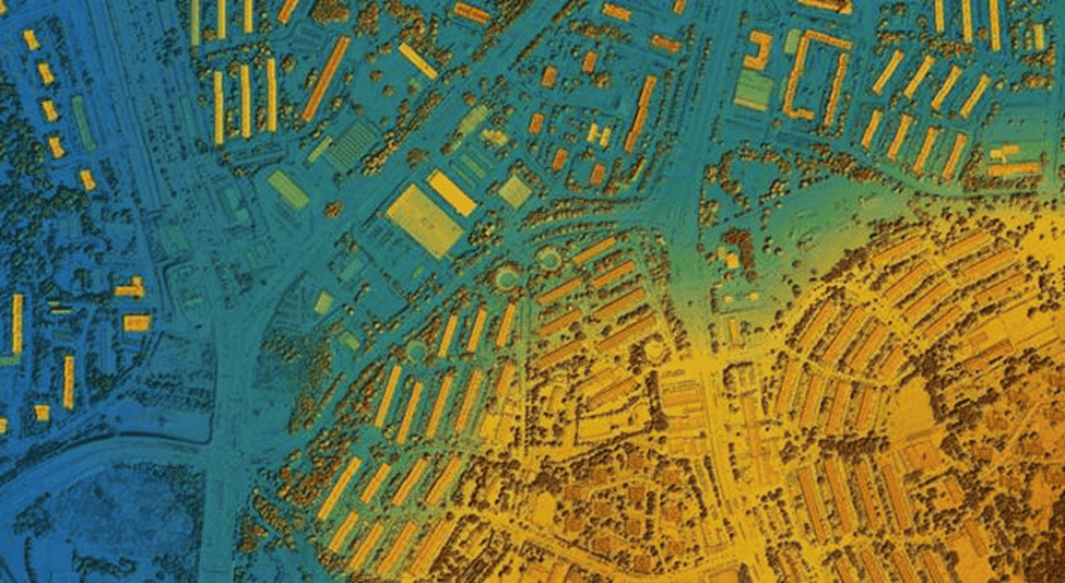
3. Topographic Maps
A topographic map looks busy at first glance, full of thin, curving lines that twist around each other. Each of those lines marks a height on the ground. When they spread apart, the ground evens out again. At first it can look messy, but give it a moment and you’ll start to see the hills and dips form in your mind.
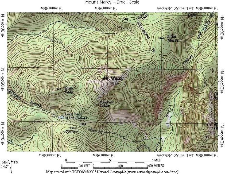
Plenty of people use these maps. Builders check them before work begins, hikers rely on them for routes, and scientists trace where rain might settle after storms. The lines, called contours, quietly show how the ground moves, up, down, and around.
In GIS, it works the same way but without paper. Computers pull data from satellites and surveys to show how the ground sits. The result, called a digital elevation model, gives a three-dimensional view you can measure and study from anywhere.
Whether you hold a printed one or view it on a screen, the idea doesn’t change. A topographic map helps you see how the land lies, not just where places are, but how the surface beneath them behaves.
4. Thematic Maps
A thematic map is a map with a purpose. Instead of showing everything, it focuses on one subject, like population, rainfall, or temperature. It doesn’t try to explain the shape of the land or where cities sit. It tells a story through colour and pattern, letting you see how one theme changes from place to place.
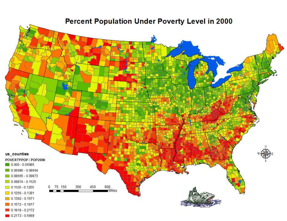
You’ve probably come across one without noticing. A weather map on TV that shows rainfall in blue and sunshine in yellow, that’s a thematic map. So is a chart of population density or the spread of forests across a region. Every colour or mark has a reason behind it. You don’t read these maps like charts or tables, you simply look and understand what they’re showing.
People in many areas use these maps. Governments plan resources with them. Farmers check soil and moisture levels. Health workers track diseases. Even companies use them to spot where people might buy more of something.
Inside GIS, thematic maps behave more like living pictures. You can zoom in, shift colours, or swap data layers to see new patterns appear. No matter how simple or detailed, the idea stays the same, turning complex information into something you can understand just by looking.
5. Climatic and Weather Maps
Climatic and weather maps show what happens in the sky, things like rain, wind, and heat. They make it easy to spot why one area feels cooler while another stays warm. You’ll often see them on the evening news or inside a weather app that updates through the day.
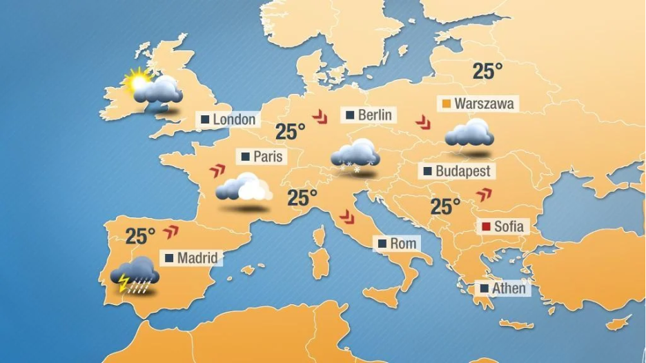
The colours on a weather map do most of the talking. Blue and green often show rain or clouds, while yellow and red mark the warmer spots. Those soft, winding lines called isobars link places with the same air pressure. They help you guess how the wind moves around.
Climatic maps cover a longer span of time. They don’t show today’s rain but the usual pattern, how wet, dry, hot, or cold places tend to be through the seasons. Farmers check them before planting, builders use them when planning structures, and environmental workers rely on them for safety and design choices.
In GIS, this kind of mapping uses live satellite feeds and stored weather records together. The system builds layers showing rain, temperature, and wind over vast areas. Whether you’re checking next week’s forecast or studying long-term change, these maps turn air movement into something you can actually see.
6. Road and Transportation Maps
Road and transportation maps are probably the ones people use the most. They show roads, train routes, and paths that keep towns and cities linked. You’ll spot them on phone screens, in cars, or pinned near station doors, the kind that help people find their way without much trouble.
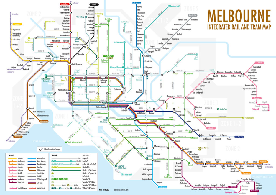
A road map does more than draw lines. The thicker ones mark big routes like motorways. The thinner lines lead to smaller towns or side roads. You’ll also notice little pictures for fuel stops, rest areas, or bridges. Together, they make travelling simpler and easier to plan.
Digital maps have changed everyday travel. Apps like Google Maps or Waze show what’s ahead, a traffic jam, a crash, or a road that’s shut. They update often, helping drivers choose another way and keep moving.
Within GIS, these maps become digital layers that planners and engineers look at closely. They help spot busy junctions, rough road sections, and places that need safety changes. The purpose hasn’t changed, it’s still about showing people the easiest and safest way to travel.
Governments rely on these maps for planning and tax work. When combined with satellite images, they help show how land is being used and whether ownership lines are up to date. It’s a simple idea, just making sure every piece of land is mapped clearly and fairly.
Also Check: Applications of GIS in Transportation
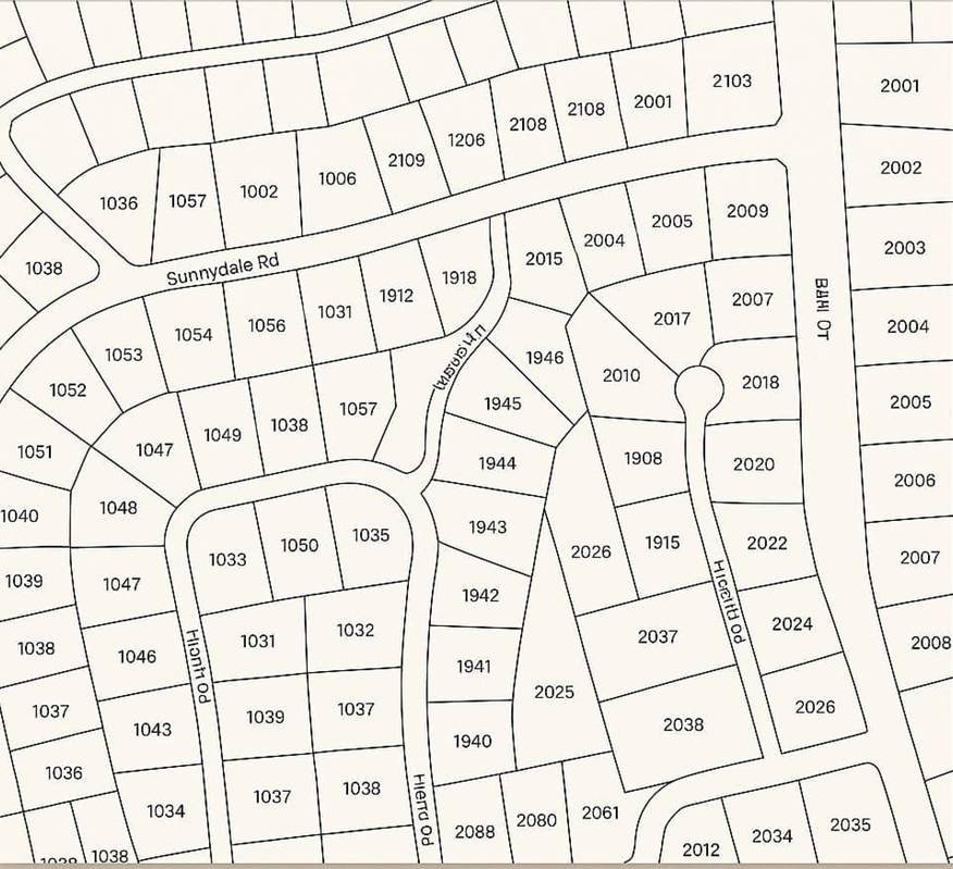
7. Land Use and Land Cover Maps
These maps show what people do with the land and what still lies on it. You might see towns, farms, forests, or rivers all sharing the same space. Some areas are built up, others still natural.
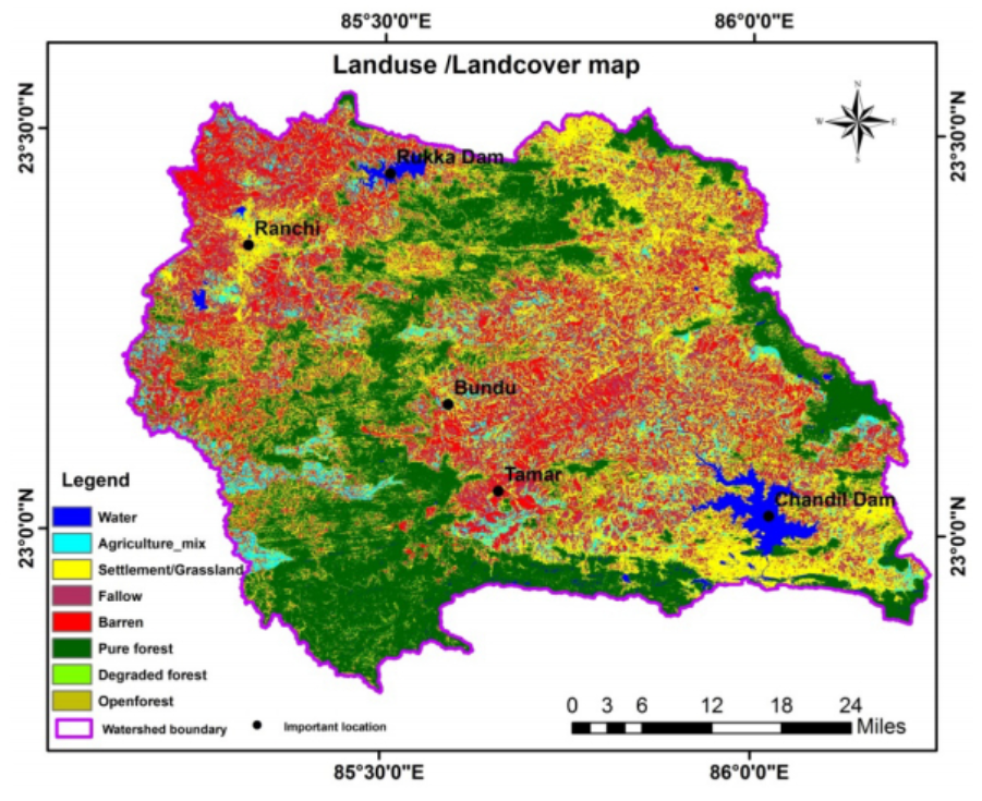
Planners, farmers, and environmental teams use them for different reasons, to track city growth, plan crops, or check forest loss.
Land use is what people do with land, building, farming, or paving roads. Land cover is what’s really there, trees, grass, or bare soil. When you look at both together, the picture becomes complete.
In GIS, satellite images help update these maps over time. By comparing one year to another, you can see how fast places change, new roads appear, fields spread, forests shrink.
8. Navigational and Nautical Maps
These maps help people travel safely by sea or air. They show coastlines, water depth, flight paths, and areas to avoid. Every mark means something, a safe route, a shallow spot, or a warning.
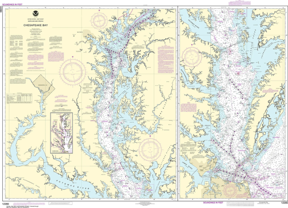
Sailors and pilots use them daily. Even a small shift in wind or tide can cause problems, so they keep checking new charts to stay on track.
Most of these maps are now digital. GPS and electronic charts show real-time position, speed, and nearby routes. The aim stays simple, to keep journeys safe and accurate.
Recommended reading: GIS in Aviation
9. Geological Maps
Geological maps show what’s below the ground. They point out rock types, cracks, and layers that shape the land. Each colour means something, one for limestone, another for clay, maybe a fault line between them.
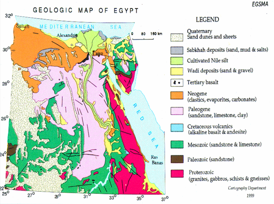
People who build or dig look at these maps first. A weak patch of soil or a buried rock can change how work gets done. It saves time to know what’s under there before starting.
In GIS, these maps turn digital. Survey notes, drilling data, and satellite images come together to form a clearer view of the land beneath us. Whether for research or construction, they help people see what they can’t see directly.
10. Historical Maps
Historical maps show how places once looked. They bring old worlds to life, towns that vanished, rivers that changed course, borders that shifted with time. You can almost picture people moving through those places long ago.
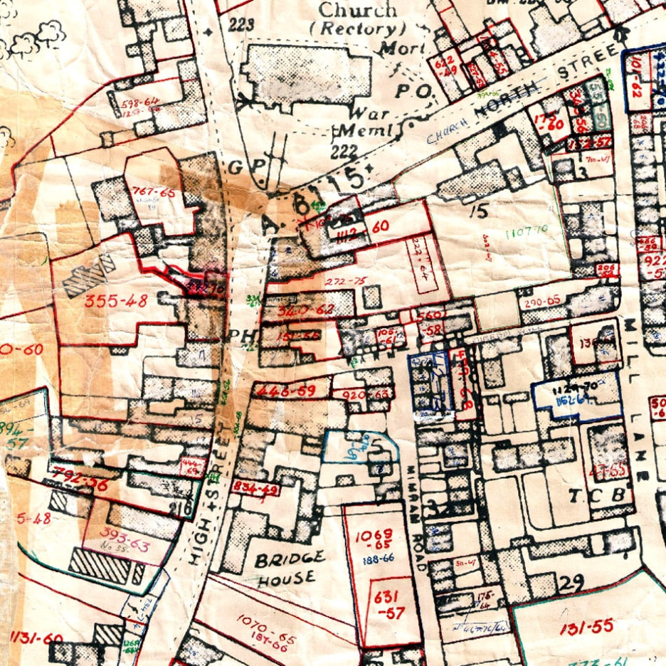
Researchers use them to see how land and life evolved. An old map might show a village turning into a city or a trade path fading into memory.
Now, many of these maps are brought into GIS. When laid over modern maps, the changes stand out, new roads, moved coastlines, redrawn borders. It’s like watching time trace its own lines on the earth.
Why Understanding Map Types Matters
Every kind of map tells its own story. Some show where things sit, others hint at how they change. Knowing which one you’re reading helps you see what it can really tell you, and what it can’t.
A builder might lean on a topographic map. A scientist could be studying a thematic one. Everyone uses maps differently, each looking for something unique. They’re not just for finding places, they help us understand how the world connects.
In GIS, this knowledge becomes even more useful. By combining maps and layering data, people see patterns they couldn’t spot before, from flood risks and soil types to city growth and traffic flow.
Real-World Example: How Different Maps Work Together
When planning a new city area, no single map can do the job alone. A political map shows where the boundaries fall. A topographic one tells how the land rises or drops. Land use maps show what’s already built, and road maps guide how new routes can fit in.
Planners layer these maps together to see the full picture. They check if new roads cross flood zones, if houses sit on safe ground, and if services like schools or parks are in reach. Each map adds a small piece of the puzzle.
In GIS, this becomes much easier. Digital layers stack on one another, helping teams see how changes in one part affect the rest. It’s the same maps we’ve always used, just clearer, faster, and better connected.
Need maps that work together instead of on their own?
Let us help you create layered GIS maps that reveal patterns and support better decisions.
📞 Schedule a Call | 📩 Email Us | 💼 Contact us Now
Conclusion
Maps haven’t really changed what they do, only how we look at them. We still turn to them to make sense of places, though now it’s a screen instead of paper.
In GIS, every kind of map sits side by side, the kind that shows height and slope, the one that tracks borders, or the one that marks rainfall. Together they show what’s happening on and under the ground, giving context that a single map alone can’t.
Maps aren’t just for directions anymore. They tell how everything fits, each ridge, river, and road part of a story that keeps unfolding.