Catchment area maps translate a loose idea of reach into a defensible, testable model. Instead of guessing who is within range, you use the network and time to show who can realistically access a site or service. Done well, catchments make siting, coverage and service decisions clearer, audit-ready, and easier to explain. By the end of this article you should know when to use catchments instead of simple buffers, what data and assumptions matter, which delineation methods fit which decisions, and how to turn outputs into decision-grade metrics.
Catchment mapping in decision support
Catchment area maps are a practical GIS method for understanding the real reach of a store, depot, clinic, hub or service team. The value is not in pretty polygons, it is in making choices defensible. A catchment turns a general idea, such as people within 20 minutes, into a repeatable model that can be tested, compared and explained to stakeholders.
Teams are often caught out by assuming catchments are only for retail. The same approach supports urgent care accessibility, field service coverage, EV charging rollout, telecoms availability and public sector planning. The difference is the constraints. Road networks, shift patterns, eligibility rules and capacity limits all change what reachable means for a given service.
Good catchment mapping is decision support, not prediction. It will not tell you exactly who will choose you, but it will narrow the range of plausible demand and show where assumptions fail. For context on the broader technique family, catchments sit within GIS spatial analysis workflows, where distance, movement and interaction are modelled rather than guessed, see what spatial analysis involves.
Catchments versus radius buffers
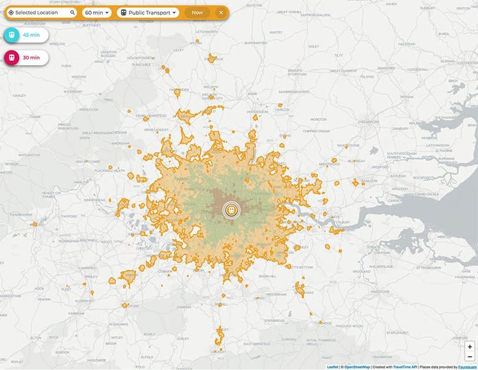
A radius buffer draws a circle around a site as the crow flies. It is quick, but it ignores what makes travel possible or impossible: bridges, motorways, one-way systems, rivers, rail lines and congestion. A catchment is usually based on travel time or distance along a network, which is why it produces irregular shapes that follow the road or path network.
Buffers still have a place for early screening and high-level comparisons, but they can mislead when you are making costly decisions such as new sites, closures or redesign. The more your customers behave like travellers rather than birds, the more you should move from buffers to network-based catchments.
Common decisions catchments inform
Catchment maps feed decisions where reach and coverage need evidence, including siting new locations, rebalancing a portfolio, planning delivery areas and setting service standards, for example 80% of households within 30 minutes. They also support operations: placing response teams, splitting territories and finding routes or corridors that create vulnerability if disrupted.
Define the decision first. If it is about access, build catchments around time and mode. If it is about demand capture, you will likely need allocation logic and competition effects.
Catchment zones and movement patterns
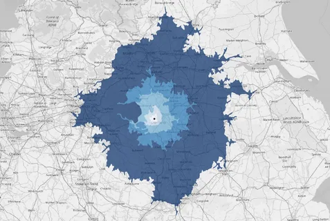
Real-world reach is rarely a single boundary. It is a gradient, with core areas of high likelihood, marginal areas where people may switch to alternatives and fringe areas that are only served in certain conditions, such as off-peak or when capacity is available.
Time bands, for example 0 to 10, 10 to 20 and 20 to 30 minutes, are often more useful than one polygon. They help relate movement to behaviour, such as willingness to travel, drop-off with time and the effect of barriers like rivers or town centres. In stakeholder sessions, zoned catchments are often the first map that makes a hidden access problem obvious.
Data inputs and modelling assumptions
The credibility of a catchment study depends more on inputs and assumptions than on the tool. Two teams can run the same software and get different answers because they used different networks, speeds or demand definitions. Clients may expect a single correct catchment. In reality there is a plausible range, depending on scenario.
Document assumptions early and test sensitivity. If you change average speeds by 10%, do your priority areas change. If you switch between peak and off-peak travel, do underserved areas appear. Treat assumptions as model parameters that can be agreed and audited, not hidden settings in a black box.
Align inputs with how the organisation measures performance. If KPIs are based on response time, straight-line distances will not align with reality. If equity or accessibility is a driver, add demographic and deprivation baselines, not just road lines.
Customer and demand location data
Demand data can be customer addresses, postcode centroids, property points, footfall proxies or device-location aggregates. The right choice depends on privacy constraints and the granularity your decision requires. For many UK projects, postcode-level demand is a workable compromise, but it can blur dense urban variation or rural access issues.
More detail is not always better. Highly granular customer locations increase governance burden and add little value if your network model is coarse or your decision is strategic. Aim to represent demand accurately enough to change decisions, and no more.
Networks, travel modes and constraints
Your network dataset is the engine of catchment mapping. Road networks need correct connectivity, restrictions such as one-way streets and turns, and sensible speeds. Walking and cycling catchments need path access rules, barriers and gradients, and may require different sources than vehicle routing.
Constraints matter. Time windows, vehicle types, low-emission zones, height or weight limits and ferry crossings all change reach. If modelling emergency response, you may assume blue-light routing. If modelling consumer behaviour, you should not. When mode choice is mixed, for example walk plus public transport, be clear whether you are modelling true multimodal travel or using simplified assumptions.
Reference layers and benchmarking data
Reference layers add context and benchmarking: administrative boundaries, land use, population grids, deprivation indices and competitor locations. These turn a catchment from a technical artefact into a decision-ready output.
Benchmarking is valuable when stakeholders challenge the model. If predicted travel times align with observed journey datasets, or coverage metrics align with service logs, confidence increases. Where benchmarking diverges, adjust assumptions rather than defend a flawed map.
Catchment delineation methods
Catchment is a catch-all term for several methods, each suited to different questions. A service area isochrone is often the starting point, but it will not answer competition, capacity or customer choice on its own. Choosing the right delineation avoids false precision and ensures outputs match the decision.
In delivery we often build in layers. Begin with network isochrones to understand physical reach, then introduce allocation to avoid double-counting demand, and finally add gravity or choice modelling where competition is real. Do not over-engineer. If stakeholders cannot explain the method, they may not trust the result, even if it is technically sound.
For a grounded explanation of the artefact itself, see how isochrone maps are generated and what they do, and do not, represent.
Network isochrones for service areas
Network isochrones delineate areas reachable within a set travel time or distance along a network. They are ideal for service standards, such as within 15 minutes, and operational planning where time is the primary constraint.
Isochrones do not allocate demand. Two nearby sites may have overlapping isochrones, but overlap is not served twice. Isochrones also assume everyone within the boundary is equally likely to use the service, which is rarely true. Use them as a baseline, then refine with demand and choice logic.
Commercial analysis from catchments
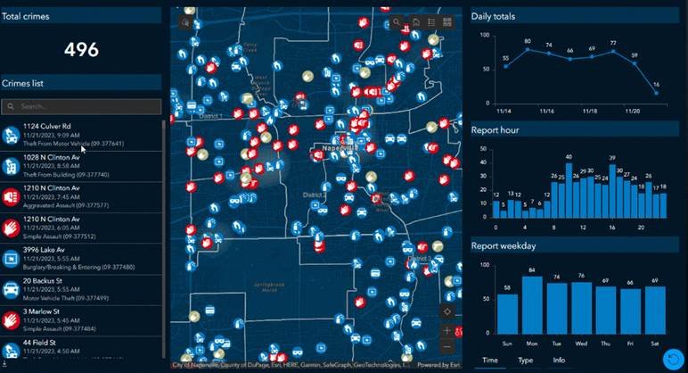
Commercial value comes from linking catchments to metrics decision-makers recognise: coverage, access, risk, growth and efficiency. A map alone rarely changes anything. A quantified comparison usually does. The most useful deliverables combine spatial outputs with tables and dashboards that summarise demand, gaps and overlaps.
Analysis can become contentious if it appears to grade communities or deprioritise areas. Separate what the catchment shows, accessibility and reach, from what the organisation decides, investment, service levels and equity commitments. Being explicit about that distinction keeps analysis objective.
If you want to connect catchments to broader workflows, frame outputs within the benefits of geospatial data in analytics to keep analysis repeatable and auditable.
Coverage, access and equity metrics
Coverage metrics summarise how many people, households, customers or assets fall within set time bands. Access metrics can include average travel time, percentiles such as the 90th percentile, and identification of cold spots beyond service standards.
Equity adds distributional questions. Are certain groups systematically further away. In the UK, that might mean referencing deprivation indices or rurality classifications. Equity results depend on baseline datasets and the scale of analysis. Postcode-level studies can mask disparities within urban neighbourhoods, so the chosen geography should match the sensitivity of the decision.
Overlap, competition and network efficiency
Overlap is not automatically bad. In some settings it provides resilience and customer choice. In others it suggests duplication and wasted capacity. Match the analysis to the operating model. Overlap between response teams may reduce single points of failure. Overlap between retail outlets may cannibalise sales.
Competition analysis usually layers competitor sites and compares reachable demand under similar assumptions. Be consistent. Using different data quality or travel modes for you versus them will bias conclusions. Network efficiency metrics, such as average drive time per served demand unit, help quantify trade-offs between reach and operational cost.
Demand forecasting and prioritisation
Catchments support forecasting when combined with demand models, for example current customer distribution, population growth, housing allocations or planned infrastructure. In UK planning it is common to test how committed developments change the reachable market or service burden over time.
Prioritisation often becomes a ranking exercise. Which new site gives the biggest coverage gain. Which closure causes the least harm. Which corridor investment cuts the largest access gap. The most practical output is a transparent scoring method that stakeholders can challenge and adjust, not a single optimal answer that no one can interrogate.
Conclusion: Catchments are only as good as the decisions they feed
Catchment mapping is not an end in itself. Every method discussed here; isochrones, allocation models, gravity weighting, equity overlays, is a means to one thing: reducing the gap between assumption and reality when a consequential decision is on the table.
The most common failure in catchment work is not technical. Teams invest in the right software and the right network data, then present outputs to stakeholders who either over-trust the model or dismiss it entirely. Both reactions stem from the same root cause: the assumptions were never made explicit, the sensitivity was never tested, and the link between the spatial output and the actual decision was never clearly drawn.
Before commissioning or building a catchment study, define the decision it serves. If you cannot name the choice that will change based on what the map shows, the analysis risks becoming a reporting exercise rather than a decision tool. Once the decision is defined, work backwards: which metric matters, which population counts, which travel mode is realistic, and what level of precision is actually required.
Start simpler than you think you need to. A well-documented isochrone with honest assumptions and a clear coverage metric will outperform an elaborate gravity model whose parameters no one can explain. Complexity earns its place only when simpler methods have been tested and found insufficient.
Finally, treat the catchment as a living model, not a one-time deliverable. Demand shifts, infrastructure changes, competitor locations move and service standards evolve. A catchment built to be auditable and repeatable will compound in value over time. One built for a single presentation will be questioned the moment conditions change.
The goal is not a perfect map. It is a defensible model that makes the next decision a little less of a guess.